There are two key decision points when it comes to your investments. When to invest and where to invest?
The question of when to invest is a hard one to answer, unless you are a fortune teller. There are arguments to support the theory that instead of trying to time the market, just keep investing periodically to dollar cost average and reduce the impact of volatility. We have explored this topic in detail in our recent post.
Addressing the question of where to invest requires an assessment of the risk and returns involved. One of the most widely accepted methods of doing so is the Modern Portfolio Theory (MPT) formulated by Harry Markowitz who won the nobel prize for it.

What is Modern Portfolio Theory?
MPT posits that an investment’s risk and return cannot be viewed in silo and needs to be evaluated based on its impact on the overall portfolio. It provides a mathematical framework for assembling a portfolio of assets so as to maximise the returns for a given level of risk, or minimise the risk given the desired level of expected return.
MPT is one of the most commonly used frameworks to achieve optimal diversification among different assets to reduce the overall risk of the portfolio. Let us explore the types of risks involved with investing, how diversification helps reduce them and how MPT can be used to select a portfolio that provides the highest returns given your risk appetite.
Types of risks
The returns on individual assets are affected by two main kinds of risks:
- Systematic risks – These are risks that affect all assets and cannot be reduced through diversification. For example risks such as war, recessions, etc.
- Unsystematic risks – There are risks that are specific to the asset. For example, for a stock, it might be risks such as decline in sales, industry-specific risks or obsoletion of technology. For a bond, it might be risks such as default risk or change in interest rates. These risks can be reduced by diversification.
How does diversification help?
Diversification reduces the overall unsystematic risk by adding different types of assets to the portfolio. Some of the key areas you should look at while choosing your assets include:
- By asset class – You should diversify among different assets like stocks, bonds, real estate, commodities, etc. This reduces the asset class specific risks (e.g. default risk for bonds).
- By geographical region – This involves holding assets from different regions. For example, holding stocks from American and Asian markets. This will help to reduce country specific risks like political turmoil or civil war.
- By industry – Each industry has risks that are specific to it. For example, the tourism industry is exposed to risks of a disease outbreak. Holding assets linked to different industries can help reduce the overall risk.
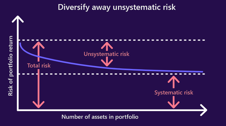
As you can see in the graph below, the overall portfolio risk reduces as you increase the number of assets in the portfolio. As you add on more assets, the unsystematic risks reduce until they are eliminated, leaving behind only the systematic risks. This is the ultimate goal of diversification.

Now that we have seen how diversification reduces risk in the portfolio, let us see how to identify the best level of diversification.
Selecting the level of diversification: Efficient frontier
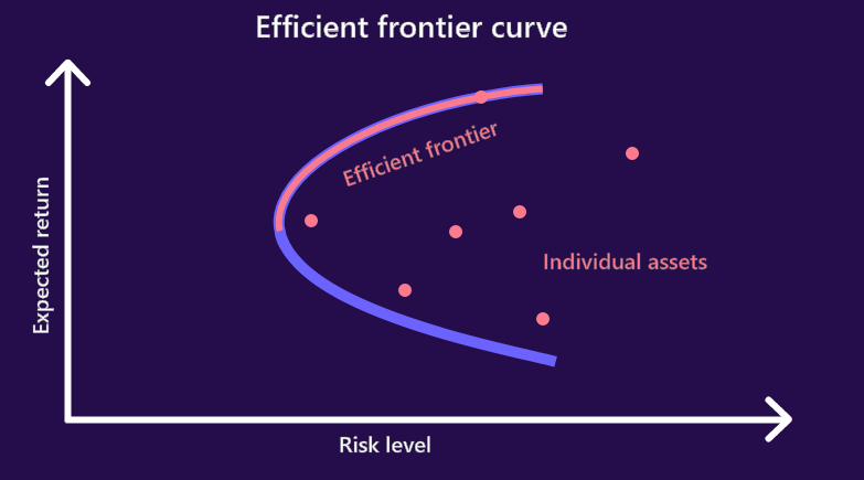
The graph below shows the expected return vs risk level for different portfolio allocations given a number of assets. The upper part of the curve is referred to as the “efficient frontier”, which represents the most efficient portfolio allocations for a combination of assets. This provides the most desirable portfolios, which offer the best returns at any given risk level, or vice-versa allow you to minimise the risk for a desired level of expected return.

Bottom Line
While constructing a portfolio, diversification is extremely important to reduce the overall risks. MPT provides a mathematical basis to this diversification and provides us a template to follow in order to maximize returns for a given level of risk. Using this to design your passive investing portfolio is the best known strategy in modern times to set you on your path to achieving your goals.
Stay tuned to our blog for a deeper dive into MPT and how it helps achieve an ideal diversified portfolio.